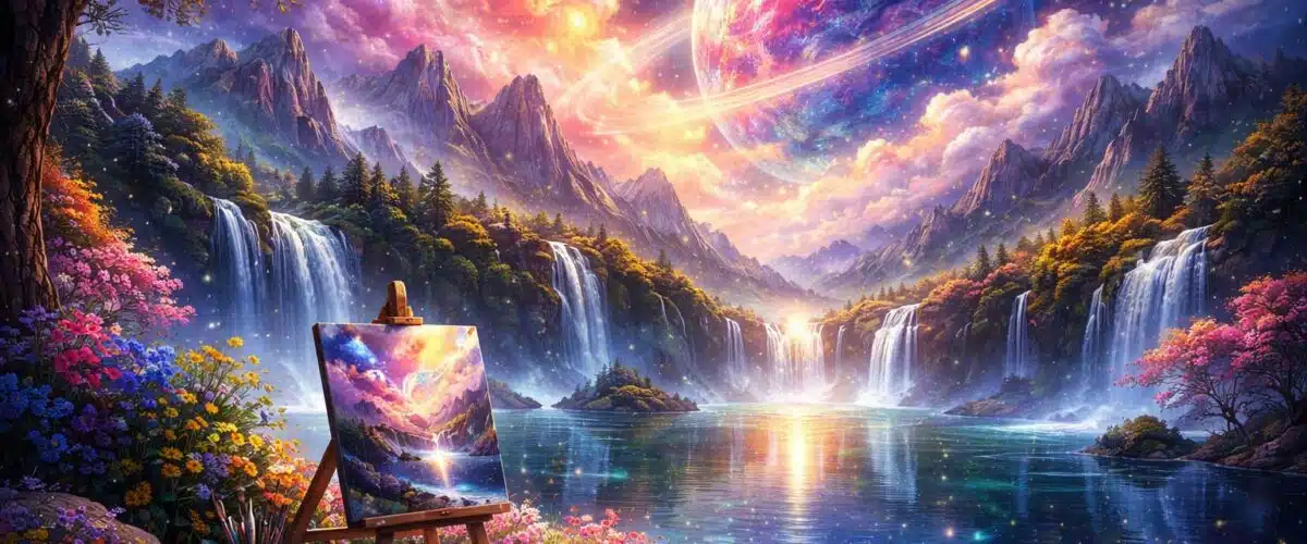
How to Create Amazing Wallpaper Art with AI in 2026
Quick answer: the best AI wallpaper art comes from designing for the screen first, not from writing the most dramatic prompt. Start with the target device, choose the right aspect ratio, protect safe space for icons and widgets, generate several controlled variations, then upscale and export carefully.
AI wallpaper art sits between creative prompting and practical design production. A render can look brilliant in a gallery view and still fail as a wallpaper if the focal point is cropped, the contrast fights app icons, or the image falls apart after compression. This guide explains the full workflow: planning, prompting, tool choice, crop safety, editing, upscaling, export settings and common failure points.
The advice below is written for creators, site owners, designers and hobbyists who want wallpapers that work on real phones, laptops, tablets and ultrawide displays. It also uses the same image-generation scoring framework behind our best AI image generation tools roundup, so the tool recommendations are based on image quality, prompt fidelity, consistency and editing control rather than vague preference.
2026 update: what has changed in AI wallpaper workflows
The core wallpaper problem has not changed in 2026: screens still crop, icons still need readable space, and over-detailed images still become tiring after a few days. What has changed is the amount of control available before and after generation.
Most serious AI image tools now handle native aspect ratios better, offer stronger variation controls, and make inpainting or outpainting less awkward than earlier workflows. That matters for wallpapers because you rarely need one perfect square image. You need a set of crops that feel related: phone lock screen, desktop background, ultrawide version, dark mode version and sometimes a cleaner variant for icon-heavy home screens.
The practical takeaway is simple. Do not treat AI wallpaper creation as a single prompt. Treat it as a small production pipeline.
What problem AI wallpaper art actually solves
Wallpaper sounds easy until you try to make one people actually use. A good wallpaper has to look interesting without demanding attention. It must survive different screen shapes, operating system crop behaviour, widgets, docks, clocks, taskbars and app grids.
AI helps because it lets you explore style, colour and composition quickly. You can generate a calm abstract set for dark mode, a cinematic landscape pack for desktops, or seasonal variations around one visual identity without manually illustrating each file from scratch.
The hard part is control. In practice, weak wallpaper workflows usually break down in five places:
- Wrong aspect ratio: the image is generated square, then forced into a tall phone or widescreen crop.
- No safe space: the most detailed part of the image sits exactly where icons, clocks or widgets appear.
- Too much visual noise: the wallpaper looks impressive full-screen but becomes irritating behind UI elements.
- Inconsistent sets: every wallpaper uses a different palette, camera angle or illustration style.
- Poor export choices: gradients band, sharp edges get crunchy, or the final file is unnecessarily large.
AI solves the exploration problem. It does not solve the design judgement problem for you.
How AI wallpaper generation works as a workflow
A reliable AI wallpaper workflow has four stages. Skipping any one of them usually shows up later as bad cropping, awkward artefacts or inconsistent packs.
Plan the screen before the prompt
Decide where the wallpaper will be used first. A desktop background, phone lock screen and ultrawide monitor are not just different sizes. They have different visual demands. Desktop wallpapers usually need calmer corners and edges because icons and windows often sit there. Phone wallpapers need space for the clock, widgets and app grid. Ultrawide wallpapers need enough horizontal structure that the image does not feel stretched.
Generate with composition rules
A weak prompt only describes the image. A strong wallpaper prompt describes how the image should behave on a screen. Terms like “large negative space in the upper third”, “calm left side”, “centred focal point”, “low contrast background” and “no text or logos” are more useful than adding another adjective about style.
Iterate without changing everything
The mistake most people make is rewriting the prompt from scratch after every result. That creates style drift. Keep the palette, composition rule and style phrase stable, then change one variable at a time: subject, lighting, accent colour or texture.
Finish like a designer
Upscaling, cleanup and export are not boring afterthoughts. They are where a decent AI image becomes wallpaper-ready. Remove almost-text shapes, soften icon zones, outpaint edges for alternate crops and test the final file on at least one phone and one desktop screen.
Aspect ratios and crop safety for wallpaper art
Resolution gets too much attention. Composition matters more. A 6K image with the subject jammed into the top corner can still fail on a phone, while a cleaner 1440p image with good safe space can feel premium.
Microsoft’s Windows background fit guidance is a useful reminder that operating systems may fill, fit, stretch, centre, tile or span wallpapers depending on user settings. Fill can crop. Fit can add borders. Stretch can distort. That is why the focal point should not depend on a fragile edge crop.
| Target | Common aspect ratio | What to optimise for | Practical prompt instruction |
|---|---|---|---|
| Desktop or laptop | 16:9, 16:10 | Icons, taskbar, windows, readable edges | “Wide wallpaper composition, calm corners, clean sky or gradient space” |
| Ultrawide monitor | 21:9, 32:9 | Horizontal balance without empty-looking sides | “Panoramic scene, layered depth across the full width, no central clutter” |
| Phone lock screen | 9:16, 10:19 | Clock, widgets, camera cutout, notification area | “Vertical wallpaper, large negative space near the top, subject in lower middle” |
| Phone home screen | 9:16, 10:19 | App icon readability | “Low contrast background, soft detail, no busy pattern behind icons” |
| Tablet | 4:3, 3:2 | Portrait and landscape rotation | “Balanced central focal zone, no important details near edges” |
Best AI image tools for wallpaper creation
Wallpaper creation rewards different strengths from general image generation. The most useful traits are image quality, prompt fidelity, consistency and editing capabilities. A tool that makes beautiful one-off artwork may still be frustrating if it cannot follow layout instructions or produce consistent variants.
| Tool | Overall score | Star rating | Image quality | Prompt fidelity | Consistency | Editing | Best wallpaper use case |
|---|---|---|---|---|---|---|---|
| DALL·E | 9.3/10 | ★★★★½ | 9.5 | 10.0 | 9.0 | 8.5 | Clean, detailed wallpapers where prompt accuracy matters most |
| Midjourney | 9.1/10 | ★★★★½ | 9.3 | 8.5 | 9.0 | 8.0 | Cinematic, stylised and mood-heavy wallpaper sets |
| Adobe Firefly | 8.9/10 | ★★★★½ | 9.0 | 9.0 | 8.5 | 9.5 | Commercially safer packs and strong edit workflows |
| Stable Diffusion | 8.5/10 | ★★★★½ | 8.8 | 8.0 | 8.5 | 7.5 | Custom local workflows, model control and experimentation |
| Ideogram | 8.2/10 | ★★★★☆ | 8.5 | 8.8 | 8.5 | 7.0 | Wallpaper concepts that need accurate text or poster-style layouts |
| Leonardo AI | 8.2/10 | ★★★★☆ | 8.3 | 8.3 | 8.0 | 7.5 | Fast visual exploration and versatile style testing |
| FLUX | 8.0/10 | ★★★★☆ | 8.0 | 7.5 | 8.0 | 8.0 | Controlled customisation and tinker-friendly variants |
| Freepik AI Image | 7.9/10 | ★★★★☆ | 7.8 | 7.5 | 7.5 | 8.5 | Stock-style backgrounds and fast usable wallpaper assets |
| Microsoft Images | 7.4/10 | ★★★½ | 7.5 | 7.5 | 7.0 | 6.5 | Quick Copilot-friendly photoreal wallpaper concepts |
| Recraft | 7.2/10 | ★★★½ | 7.3 | 7.0 | 7.0 | 6.5 | Graphic, vector-style and shape-led wallpapers |
For wallpaper work, DALL·E is the strongest all-round choice when you need instructions followed closely. Midjourney is often better when the visual mood matters more than exact placement. Adobe Firefly is the safer pick for commercial or brand-adjacent packs because its editing tools fit a design workflow. Stable Diffusion is the most flexible option if you are comfortable managing models, checkpoints and settings yourself.
Pros and cons of using AI for wallpaper art
| Pros | Cons |
|---|---|
| Fast exploration across styles, palettes and moods | Easy to create images that fail once cropped to a device |
| Strong for abstract, landscape, surreal and illustrative backgrounds | Small artefacts become annoying because wallpapers are seen repeatedly |
| Can produce matching sets faster than manual illustration | Style drift is common if prompts are rewritten too aggressively |
| Editing tools can rescue near-misses with inpainting and outpainting | Gradients, skies and dark backgrounds can show compression banding |
| Useful for personalisation at scale, including seasonal packs and colourways | Commercial usage still depends on the tool licence and source material rules |
Prompt anatomy for wallpaper-quality AI art
A wallpaper prompt should include visual direction and usage direction. The usage direction is the part most beginners miss.
Use this structure:
- Subject: what the image contains, such as a mountain valley, abstract waves, a quiet city street or geometric shapes.
- Style: the visual treatment, such as cinematic, soft gradient, vector-clean, painterly or minimal.
- Palette: a limited colour scheme rather than a pile of colour words.
- Lighting: soft morning haze, low contrast studio light, twilight glow or muted backlighting.
- Composition: where the focal point sits and where negative space should be reserved.
- Wallpaper instruction: make it clear that the output must work as a background, not a poster.
- Negative constraints: no logos, no watermark, no random text, no busy patterns, no faces unless needed.
| Goal | Prompt pattern | Why it works |
|---|---|---|
| Icon-friendly abstract wallpaper | Smooth abstract gradient waves, soft lighting, low contrast, minimalist, large negative space in the upper third, designed as a wallpaper background, no text, no logos | Low contrast and negative space keep icons readable. |
| Cinematic desktop landscape | Wide mountain valley at dawn, atmospheric haze, subtle colour grading, centred horizon, clean sky area for desktop icons, wallpaper composition, no people, no text | The clean sky gives the UI somewhere calm to sit. |
| Dark mode phone wallpaper | Moody dark abstract texture, soft vignette, deep navy and charcoal palette, subtle highlights near the lower third, vertical wallpaper, no text, no watermark | The clock area stays calm while the lower section carries the visual weight. |
| Graphic wallpaper set | Minimal geometric shapes, flat colour blocks, modern vector poster style, balanced composition, calm background, wallpaper, no typography | Flat shapes survive scaling and compression well. |
One practical note: “high detail” is not always your friend. Premium wallpapers often feel slightly restrained. If the image is screaming for attention, it will probably age badly on a home screen.
How to create a matching wallpaper pack without style drift
One wallpaper is a prompt. A wallpaper pack is a system. To make images feel related, lock three elements before you start generating variations.
- Palette: choose a limited colour set, such as deep teal, charcoal and soft gold.
- Composition rule: keep the same safe-space logic, such as calm upper third or centred focal zone.
- Style phrase: repeat the same descriptive phrase, such as soft airbrushed gradient or cinematic haze.
Then make small changes. Swap the subject from mountain valley to coastal cliffs. Change dawn to twilight. Move the accent colour from gold to violet while keeping the base palette. Add subtle paper grain instead of bokeh. Do not change all of these at once.
If your tool supports seeds, reference images or style presets, use them. They are not magic, but they reduce the chance of a set turning into ten unrelated images. For copy that sits around a wallpaper pack, such as titles, descriptions and release notes, AI writing tools can help create consistent naming and descriptions without turning the visuals into an afterthought.
Editing steps that make AI wallpaper look finished
Most AI wallpapers need small edits. Not dramatic edits. Small ones. That might mean removing an odd speck near the clock area, extending the side of a landscape for ultrawide, or lowering contrast behind app icons.
Soften the UI zones
Look at where icons, widgets and clocks will sit. If that area is busy, reduce contrast, add a light blur or regenerate with more negative space. This is especially useful for phone home screens, where even a beautiful image can become irritating if every app label fights the background.
Remove almost-text and micro-artefacts
AI models often create shapes that look a little like letters, symbols or tiny logos. They are easy to ignore during generation and impossible to ignore after you notice them on your lock screen. Clean these before export.
Outpaint for alternate crops
Do not stretch a phone wallpaper into a desktop wallpaper. Extend the canvas properly. Outpainting lets you keep the central mood while adding believable space at the sides or top.
Control sharpness after upscaling
Upscaling should make the image cleaner, not harsher. Over-sharpened wallpapers look crunchy on high-DPI screens and can shimmer around fine lines. For backgrounds, softer usually feels more expensive.
Export settings that hold up on real screens
Export is where good gradients often get ruined. Dark abstract wallpapers, skies and soft colour fields are particularly sensitive to compression. Check the final image full-screen, not just inside the editor preview.
| Wallpaper type | Recommended format | Why | Watch out for |
|---|---|---|---|
| Photoreal or cinematic scenes | High-quality JPG | Good balance of detail and file size | Compression blocks in skies and shadows |
| Flat graphics or vector-style shapes | PNG if approved, otherwise high-quality JPG | Preserves sharp colour boundaries | Larger files and possible workflow constraints |
| Gradient-heavy abstracts | Very high-quality JPG, tested carefully | Works when compression is controlled | Banding in dark transitions |
| Downloadable wallpaper packs | Separate exports per device class | Cleaner user experience than one universal file | Confusing filenames if variants are not labelled |
A clean filename helps more than you think. Use a structure like haze-valley-teal-16×9.jpg or dark-waves-charcoal-phone.jpg. Once you have thirty variants, “final-final-2.jpg” becomes useless.
Buying guide: what to look for in an AI wallpaper tool
The best wallpaper tool is not always the most artistic image generator. Judge the tool by the parts of the workflow that matter after the first image appears.
- Aspect ratio support: can you generate 16:9, 9:16, 21:9 or custom sizes without awkward cropping?
- Prompt fidelity: does it follow instructions about negative space, focal point and low-detail areas?
- Consistency controls: does it support seeds, references, presets or reusable styles?
- Editing tools: can you inpaint artefacts and outpaint missing edges?
- Commercial clarity: are the usage rights clear enough for your intended project?
- Iteration speed: can you generate and compare enough candidates without the process feeling slow?
If you are publishing wallpaper packs on a site rather than just using them personally, discovery matters too. AI SEO tools can help with filenames, metadata, internal linking and page descriptions, but they cannot rescue weak visual assets. Create the right files first, then optimise the page around them.
A repeatable AI wallpaper workflow
- Choose your device targets: desktop, ultrawide, phone, tablet or a full pack.
- Define the set rules: palette, style phrase and safe-space composition.
- Write one strong base prompt: include subject, style, lighting, aspect ratio and wallpaper behaviour.
- Generate a batch: create enough candidates to compare composition, not just beauty.
- Shortlist ruthlessly: remove anything with bad crops, strange artefacts or busy UI zones.
- Create controlled variants: change one variable at a time.
- Edit problem areas: inpaint distractions, soften icon zones and outpaint for alternate formats.
- Upscale once: avoid repeated upscaling and sharpening passes.
- Export per use case: use clear filenames, correct aspect ratios and careful compression.
- Test on real screens: check at least one phone and one desktop before publishing.
Common misconfigurations and how to fix them
The image is beautiful but unusable after cropping
This usually means the focal point is too close to the edge. Regenerate with a centred safe zone or outpaint around the image before cropping. Do not rely on the operating system to choose the crop you imagined.
The wallpaper looks too busy behind icons
Reduce local contrast in the icon area. If the whole image is busy, the prompt needs a stronger composition constraint: calm background, low detail, large negative space and no repeating pattern.
The set looks inconsistent
You changed too much between generations. Go back to a fixed style phrase and palette. Then alter one thing at a time. Wallpaper packs need visual discipline more than novelty.
The gradients show banding
Compression is probably too aggressive, or the gradient is too subtle for the export settings. Use a higher-quality JPG export and inspect dark areas full-screen. A tiny amount of texture can also hide banding better than a perfectly smooth gradient.
The image looks harsh after upscaling
Dial back sharpening. Wallpapers are background surfaces, not product shots. Crisp detail is useful, but hard edges everywhere make the image tiring.
Five-minute wallpaper-ready checklist
- Generated at the target aspect ratio or outpainted deliberately
- Focal point is inside a safe central zone
- Negative space exists where icons, widgets or clocks appear
- No random text, watermark-like marks or odd symbols
- Gradients checked for banding
- Icon zones softened or kept low contrast
- Upscaled once at the end of the process
- Exported with sensible compression
- Tested on at least one phone and one desktop screen
- Named with style, colourway and aspect ratio
AI wallpaper art FAQs
What is the best aspect ratio for AI wallpaper art?
Start with the device that matters most. Use 16:9 or 16:10 for desktop-first wallpapers, 9:16 for phone-first wallpapers and wider formats like 21:9 for ultrawide displays. If you need multiple device versions, create separate crops or outpainted variants instead of forcing one master image into every shape.
How do I stop AI wallpapers looking too busy?
Add composition instructions before generating: large negative space, low contrast, calm background, subtle detail and no busy pattern. After generation, reduce contrast or apply a light blur in the area where icons or widgets sit.
Is abstract or photoreal better for wallpapers?
Abstract is usually more forgiving because it does not depend on perfect anatomy, perspective or object realism. Photoreal wallpapers can look excellent, especially for landscapes, but they need more careful artefact checking.
Should AI wallpapers be JPG or PNG?
For this publishing workflow, use JPG unless PNG is explicitly approved. High-quality JPG works well for most photoreal, cinematic and abstract wallpapers. The main thing to watch is compression banding in gradients and dark areas.
How do I make a wallpaper pack quickly?
Lock the palette, style phrase and composition rule. Then generate variants by changing one variable at a time, such as subject, lighting or accent colour. Seeds, reference images and presets can help keep the pack coherent.
Can I sell AI-generated wallpaper packs?
Sometimes, but check the licence of the tool and any source material used. For commercial packs, choose tools with clearer commercial usage terms and avoid generating work that imitates protected characters, brands or living artists too closely.
The practical takeaway
AI can generate attractive wallpaper art quickly, but good wallpapers are designed, not merely prompted. The winning workflow is screen-first: choose the device, protect the crop, control the visual noise, generate variations deliberately and finish with careful export settings.
If you only change one thing, change this: stop asking for a “beautiful wallpaper” and start asking for a specific background that leaves safe space for a real interface. That one shift usually improves the output more than any extra style adjective.
You Might Also Like:

Generative AI VS Agentic AI

Free Zoom Transcription

How To Turn Off AI On Google
